Creepin' On Your Customer

ux-design-user-experience-testing-web-design-los-angeles

I decided I should let you all in on one more facet of UX Design before we place this book back on the shelf for a little while.  (If you haven't read the last two posts on this topic, Designing In Someone Else's Shoes and The 300 Million Dollar Button click the links to get a little backstory on what we're talkin' bout!)  This last chapter is to help you verify that you're on the right track with how you're conveying the information and messages you want to impart to your customer and make sure that, basically, you know, they're picking up what you're putting down... and in the way you want them to pick it up.  One of the most accurate ways to assess if your design is user experience "compliant" is by well, asking... users, that is.  And creepin'.  Which leads me to the photo above.  A lot of times, user experience testing is about watching people use your product.  Kind of like, taking a photo of someone taking photo.  It's like a process audit that can provide insightful data that you never could have guessed about. This practice is known as "usability testing" and there are many ways to do this.  Obviously, you need to have some resemblance of your site or product to have these said sample "users" attempt to "use" it.  Otherwise, the results to whatever broad questions you may ask them about your product or site, won't be accurate. However, you don't have to build out the entire finished product and then go back and change a bunch of stuff, either.  The scale of what is acceptable in order to glean useful data from a sample of users ranges from paper napkins, to flashcards, to a rudimentary prototype, to a full-scale MVP (minimum viable product).  So first let's talk about different ways to create a sample (product/website) to test.  Then, we'll get into what a user looks like and ways to collect the data.  

ux-user-experience-design-prototyping-usability-testing

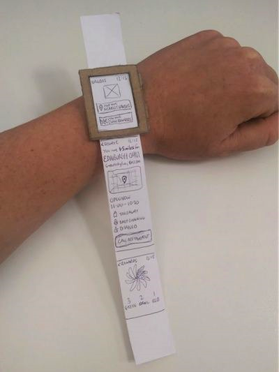
You'll probably want to assess based on your time/money resources and the impact of the data, how much effort and expense you want to put into creating a sample of your product.  In the context of a website, this can be done super cheap and quick by just drawing out on pieces of paper what certain or each page of the site will look like (where a photo is on the page, where a button is, a form field, etc).  You can also do this with index cards or sticky notes and put them up on a wall or bulletin board and put string or marker to show what buttons/links connect to where.  If you want to get more advanced in terms of flow, there is a great app called "Pop" that is free for up to 2 projects at one time, that allows you to take photos of your drawings (works best for mobile app design) and then you can create "hot button" boxes in the app around areas that would be buttons and have them link to other "page" drawings.  It's preeeettty slick, TBH.  Here a little promo video on how it works (I think it was filmed by a Spanish speaking user but it doesn't matter as the background sound is just "musica" :)

If you have a familiarity with Photoshop and can create pages for your website in Photoshop, you can then import them to another free tool called Invision, where you can add different types of functionality including links, pop-ups, buttons, menus, etc that will take the user to different pages or pull up images or forms, etc without having to code out the functionality.  Lastly, if your resources are abundant or the importance of collecting impactful user testing data is paramount, you can build out a product or website that is coded out and have users test a working site.  

Naturally, extensive testing and prototyping can be time-consuming at a minimum and very expensive at a maximum, so you may not need to draw out/build out everything.  Additionally, testers may have a limited attention span, so taking inventory and prioritizing what elements are necessary or important to test (maybe it directly pertains to sales or a customer's first impression, or their connection and loyalty to your brand), can help to eliminate wasted time or finances. 

user-testing-starbucks-testing

Now let's talk about how to find these sample "users."  Mostly you need people that are unfamiliar with your product and are unbiased and represent the type of customer you are attracting.  Your user might be anyone within a 15-65 year age range or it could be more specific like stay-at-home moms, between the ages of 40-50 who live in Los Angeles.  If your market is more specific, then you will do better to get testers who closely resemble your typical customer as the data will be more reflective about what speaks to them as well as what pain points they are experiencing.  If you have friends and family that fit within your demographic and aren't coming into the situation with some familiarity of how the product or site works, then BONUS.. User them up!  If you do require more niche users, one effective method I've heard of it to see where they hang out and then offer them something worth their while to do some quick user testing (ex: hang out at a table at Starbucks and offer to buy them their cup of coffee if they will test out your prototype or website for 5 min).  Of course, you can always hold a focus group and may need to pay or incentivize them to participate.  You can advertise the focus group on Craigslist or Facebook, etc.  Or, you can use an outside market research company to conduct focus groups for you or customer surveys and they can handle soliciting model users. 

Finally, you'll need to have the users test your prototype.  This may be obvious depending on what your product or site is.  You may want to ask the tester to try to achieve certain objectives using your product or website and then watch how they attempt to do so.  Or, you can use this fancy company called UserTesting (definitely clear messaging with their company name :) to watch videos of people using your product while giving commentary on why they are making the choices that they are.  Not gonna lie, it's not cheap, but it may end up being cheaper in the long run.. See my post on The $300 Million Button for more on this.  If you want to get really advanced, you can do A/B testing in which you have 2 different versions and test each different version with different users so you can see which one fares better. 

One thing to keep in mind when doing user testing is that you have to be willing to throw the baby out with the bath water.  Sometimes the thing we've invested a lot of time into developing doesn't resonate or communicate with our users in the way we want but that's part of the territory.  You don't keep an ineffective communication element or strategy just because you've invested a lot of time into it because in the end it will only hurt you.  Just like slot machines, sometimes, even though you've spent all night feeding that thing, you just need to cut your losses and walk away.  Walk. Away.

And on that note, we'll do the same as that concludes our programming on this topic.  See y'all next week where we'll break down sumpin' else!


Related Posts Plugin for WordPress, Blogger...

DESIGNING IN SOMEONE ELSE'S SHOES

ux-design-principles-explanation-los-angeles

Since I know you all have been waiting on the edges of your seats since last weeks post, you can cool your jets now because I've got tasty morsels of information for you today.  Those of you who didn't tune in last week, let me bring you up to speed, riiill quick.  Last week we discussed the concepts of UX Design and UI Design along with an illustrious story that highlighted the value of these ideas.  I hooked last week's readers by telling them how big of a difference including UX/UI design principles into your website or product can make and then left them with a true cliffhanger as to "HOW."  I'm SUCH a tease!  Luckily for you, if you haven't read last week's post, you can binge-read that one and this one back-to-back, without any lag time in between... Procrastination pays off!  So, peep last week's post - The 300 Million Dollar Button, before reading this post.  We'll see you back here in approximately 4 min. 

For the rest of you patient lot - let's get into it! The reality of UX guided design is there is not one right way to do it.  This is not an either/or, good/bad type of thing.  There are many ways to skin a cat and there are also many ways to design a site or product that is pleasing to the user and allows themto easily find and accomplish whatever they are trying to do/you want them to do on the site. That being said, there are some tried and true UX Design principles that influence almost all users favorably.

GET ON THE GRID

The proximity and placement of various components on a website can be fundamental for helping people determine what's going on on your site and make sense of it quickly.  A grid system helps you to convey the components of your site in an organized way that allows users to see a pattern or order and then process pieces of it in chunks (the good kind of chunks :), rather than one at a time.  A 12-grid system is generally the preferred grid as there are so many numbers that it is divisible by and thus it can be broken into a variety of combinations. 

 
UX-Design-12-Column-Grid-970
UX-Design-Website-Grid-Information-Architecture
UX-Design-Website-Layout-Grid
12-Grid-Website-Design-Los-Angeles-UX

HEAD IT UP

If a website was like Mario Kart, headers are like coins.  They're an added boost for SEO (search engine optimization) as Google give headers more credit but they also keep you on track and are like a bonus for site visitors.  Users appreciate them because it tells them what the text below is about and then they can assess if it's important to them or not.  Once again, they allow the user to process information on your site quicker.

CONSISTENCY IS KEY

When people come to your website for the first time, they don't know where anything is, how to find what they are looking for, what is important to them, or how to get to where they need to go.  Similar to looking at a map, it takes a second or two to get acquainted and familiar with what's going on, how the information is laid out and then actually read it.  Most maps have a key showing consistent elements that are repeated in the map to help the person viewing the map not have to make sense of every aspect each time from scratch.  By using consistency of fonts, colors, icons, buttons, etc for elements that are repeated throughout the site, you are essentially developing a key for the user.  If they see a button that is in a black, in a square shape with white text in a Times New Roman style font, then when they're looking for a button that does something else, their eye will have a better idea of what to look for.  Having different fonts on a website is good because it adds dimension and feeling to the design but each font choice should have a role and should be used when its role is appropriate.  For example, certain headers should be a certain font, size, color etc which should be different than regular text.  If you're explaining an instruction or non-pertinent information, you could use an italicized font in a lighter color to show the user that the information is helpful but not necessary to read.  Consistency falls under the idea of "grouping" which shows the user that things are related and have similar meaning if they have the same attributes.  Grouping allows us to digest larger amounts of information quicker and easier.  Additionally, you can use subtle lines to connect various pieces of related information together or to create sections, grouping related together as well.

DON'T REINVENT THE WHEEL

There are already ways in place that user are used to for certain basic functionality.  They are used to seeing the navigation either on the top or the left hand side of the website.  Most people are used to clicking the logo and being brought back to the home page.  They know that if certain words in a body of text are a different color, it may be a hyper link.  They are used to logging in in the top right corner of the website, etc.  You don't need to try to get cute by doing something different only to end up confusing the user.  From a business perspective, the less time you need to spend educating your customer, the better.  Don't waste the attention the user is giving you on them trying to figure out how to sign up or log in.  Save the WOW factor places where differentiating yourself will make a positive impact.

READ BETWEEN THE ALIGNS

There are times when stylistically, having different alignments or placement on a website can make a site look better but a general rule of thumb is remembering that people read left to right and top to bottom.  Therefore, placing more important things on the right hand side or at the top is a good guideline to follow. Additionally, drawing out your designs on paper is extremely helpful as studies have shown that we think better by putting a pencil to paper and you may be inclined to draw what feels natural to you (left-right, top-bottom). 

a pICTURE = 1,000 WORDS

Too much text can be a turn off to any site visitor and looks like work.  Additionally, if you have important messages about using the site or about your business or brand, that are buried in a lot of text, it may not get read and... that could be bad.  If there are opportunities to convey concepts or ideas using imagery instead of words, then use it!  Explanatory imagery could also include using icons instead of buttons with words on them, illustrations or photos as headers, or video or images to infuse brand messaging into your site.  This is a great area to get a little creative. 

dON'T TIP THE SCALE

Good design should have balance and symmetry.  Naturally, we are attracted to things (and supposedly people) that are symmetrical and balanced, so making sure your site doesn't feel lopsided will help you communicate in more stable, consistent, and harmonic ways.  Good design is always part of UX design, as aesthetically pleasing elements can make people trust you, feel calm, feel inspired, happy etc and result in a positive "experience."  However, one thing to be cognizant of is a balance between simple design that looks good and explaining important components to the user.  Clear explanation might mean more words, a larger font, premium placement, etc.  Ideally, your site does both but that can be atough balance to strike.  At the end of the day, clear layout, language and placement trumps aesthetics because, if you've brought the horse to water and he's thirsty but can't figure out how to drink, then ultimately -> FAIL. 

Ultimately, UX Design can be summed up in one word - EMPATHY.  Empathy is defined as the experience of understanding from another person's perspective - which sums it up better than I probably have in two articles.  Empathy by nature is difficult and it's impossible to truly understand how someone else feels or perceives something but you can get closer to the mark by collaborating with others when coming up with your design.  Tunnel vision is natural but by discussing or working on the design with other people who bring different skills, experiences and ideas to the table, you can create even slightly more empathetic design.  

Related Posts Plugin for WordPress, Blogger...

The 300 Million Dollar Button

ux-design-user-experience-butter-packaging

UX Design and UI Design have become popular buzz-terms in the past few years.  Maybe you've heard of them, maybe you haven't... Maybe, if you are anything like me, when you first heard them, you completely dismissed them on account of the fact that they sounded like another tech-field component that didn't really apply to you.  Actually, I think for me, the acronym-style terms themselves sounded outside of my desired realm of knowledge perhaps due to the X in the UX that made it feel like something way advanced beyond my comprehension and the UI sounded like an undesirable infection that I naturally wanted to stay far away from. Additionally, these terms actually refer to related concepts, which seemed to make them all the more confusing, IMO. So, basically, I was like, nope... ain't got time for that!  Ironically, my dismissal of the terms and their meaning is almost a metaphor for many companies' oblivion or underestimation of the concept itself. 

So, if I've now at least whet your curiosity palate and you're still wondering what the hell I'm talking about, allow me to enlighten you!

UX Design stands for "User Experience Design" and UI Design is the abbreviation for "User Interface Design."  Both concepts denote how a "user" engages with, behaves and what they experience when interacting with what you are selling.  Most commonly, the context for these terms applies to a website, but honestly, it really doesn't have to be limited to just a website.  It's an important consideration whenever you're trying to communicate with someone who is using something you have to offer.  What is the user's experience?  How are they behaving when interacting with the interface? 

UX-Design-User-Experience

If you're still not convinced this is all that important, then HORRAY!  Because... now, I can share with you the most BANANAS example to illustrate the absolute significance of why UX design is kind of... everything.

This story in UX Land is called "The $300 Million Button" and the setting is this:  

Circa probably around 2007-2008, a company who will remain anonymous but is categorized as a "major retailer" (we'll call them "X"), hired a consulting company called "User Interface Engineering (UIE)" run by a guy named Jared Spool.  They wanted to increase their sales and noticed that a lot of people were putting items in their shopping cart but not actually making a purchase.  Jared's team studied X's website and then observed people using the site.  What they found was that when people went to make a purchase, they first put the item into the virtual shopping cart, and then went to check out.  Once they hit the "Checkout" button, they were brought to a Checkout page where they were asked to either log in, if they already had an account or register.  The original website designers had assumed that people returning to the site would remember their login credentials (if they didn't there was a "Forgot Password" link below) and that new users wouldn't mind easily entering a few simple pieces of information because, after all, they would probably be back and would appreciate not having to enter all of the information again.  A reasonable assumption, but as always, you know what they say about assumptions.. "when you ASSUME, you make an ASS of U and ME". 

So, as Jared's team was observing users on the site, they noticed that people were getting really tripped up by needing to remember their information or creating a whole new account which seemed cumbersome and often times, just abandoning their cart as the friction wasn't worth it.   The feedback they received from new users was that "they weren't there to create a relationship with the retailer, they just wanted to buy something."  Additionally, first time customers couldn't always remember if it was their first time purchasing something from the site, so they would become frustrated when the site couldn't find their email address or the email/password combinations weren't matching.  UIE couldn't believe how resistant first time users were to registering. 

Things weren't any rosier for repeat customers.   They too, experienced the same frustration with their emails and passwords not working.  Some had changed emails since the last time they made a purchase from the site.  Others couldn't remember their passwords and after several, often incorrect, guess attempts, only a handful went through the process of having a new password sent to their email which they then had to reset.  All in all, it was a negative experience. 

So UIE came up with a solution. They replaced the "Register" button on the checkout page with a "Continue" button and put the following message beneath it: “You do not need to create an account to make purchases on our site. Simply click "Continue" to proceed to checkout. To make your future purchases even faster, you can create an account during checkout." They also allowed repeat customers to checkout without having to log in. 

The result?  Within the first month since the change, sales went up by $15 million and by the end of the year, $300 million, garnering a 45% increase in sales overall.

300-Million-Dollar-Button-Shopping-Cart-Photo

Pretty nutty, right?  But also, pretty worth it!  This concept doesn't necessarily have to be something that only applies to people building a website, however.  The idea of considering user "experience" when developing and building a strategy for anything you're trying to sell can be invaluable.  Considering what people respond to, what they used to seeing and don't need to relearn, what their pain points are, what isn't clear to them, and what's causing friction between them and your company, site, product, etc., can save you or earn you, depending on how you look at it, lots more money in the long run.  Opportunity cost, baby

So, I've decided to break this post up into two sections since it's so hearty, and will therefore be posting next week about ways to optimize whatever you're trying to sell to incorporate UX design and principles.  Is the anticipation palpable or what?!?!

To Be Continued...

Related Posts Plugin for WordPress, Blogger...

Knock Knock... Who's There? Your Right Brain

This is a story all about how my life got flipped turned upside down... And I'd like to take a minute, just sit right there, I'll tell you how I became a creatively-identifying person from a self-described-type-A-er. 

creative-free-spirit-girl-creativity.jpg

Up until a few years ago, I was convinced that I had been unblessed by the bountiful gene pool without the gift of creativity (did you figure that double negative out?  In other words, I felt I wasn't creative).  I had a fixed idea of what creativity was all about and I was in the other circle of the Venn diagram.. that's right, I thought about it in terms of a Venn diagram.  CLASSIC left brain behavior.  On a deeper psychological level, I believe it was born out of coming from a two-child family where I had the irrational idea that siblings couldn't share traits. That they were divided up equally and since my sister was indisputably creative in the conventional sense (artistic), I was was, by default, not... but we're not getting into that today, Freud.  We'll save that for another session

So, back to the story: My aha light bulb moment happened when I read an article on the 18 Things Highly Creative People Do Differently.  As you've probably guessed, via the most obvious foreshadowing ever, that upon reading this article, I realized that: oh me oh my, I may actually be creative after all, yada yada... I'll get into some of the key components of the article that caused my change in identity, but that's not where this story ends.  No, the real MVP of this tale, happened after a few months of acknowledging this characteristic in myself and going all-in in embracing my creative self.  Feelin my flow, so to speak.  The more I accepted and celebrated my sense of creativity, the easier it seemed to tap into it, to access it when I wanted and to harness it in ways that made sense.  

My epiphany that came from the article about how creative people were different, actually turned into the idea that creative people are not in fact different types of people but rather people that have cultivated that part of themselves more actively.  THE IRONY!  I realized that I wasn't a left brain person and that the other half of my brain was, for lack of a better word, missing.. it just hadn't been activated and incubated properly.  Full disclaimer: I'm not a psychologist or neuroscientist, BUT through my experience, I believe we all have the ability to be "highly creative" beings and we need to acknowledge and engage both "sides" of our brain to evoke the maximum amount of potential that they both have to offer... The idea I guess I'm trying to describe here is something I'll call BRAIN SYNERGY.  (haha, got to get my business blog SEO keywords in there :)

Allow me to elaborate my point by dissecting the biznas of creativity a little more.  Research has proven that creativity involves the collaboration of a cornucopia of traits, behaviors and social influences in a single person.  The very nature of creativity is all about making connections.  It's rooted in the ability to connect the dots that others might never think to connect.  In the words of the almighty Steve Jobs:

"Creativity is just connecting things. When you ask creative people how they did something, they feel a little guilty because they didn’t really do it, they just saw something. It seemed obvious to them after a while. That’s because they were able to connect experiences they’ve had and synthesize new things."

Put aside his assumption that some people are creative and others aren't and just hear me out for a second... If creativity is all about making connections then why do we continually describe it as a singular sort of trait.  It stands to reason that by encouraging the idea that your left and right brains work in tandem, we can open up a whole realm of seemingly unrelated connections that bridge the two mindsets in a way that each can enhance the other and the thus the whole is greater than the sum of its parts. BOOM!

So, whether I've lost you throughout my whole philosophical walkabout and you just want some tips; or if in fact you are feeling awakened to a whole new wave of possibilities like I was, here are some ways to get your creativity flag flying high:

DON'T BITE THE HAND THAT FEEDS YOU

Acknowledge that we all have the potential to be creative.  Albeit, fairly obvious and basically my point from above, but you're probably not going to summon many creative thoughts if you don't believe they have the ability to exist within you in the first place!

GET HOOKED ON A DAYDREAM

Daydreaming is going to be your bestie in this space.  Mind-wandering is said to aid in the process of “creative incubation” and ACTUAL neuroscientists have found that daydreaming involves the same brain processes associated with imagination and creativity.

GET OM IT!

Meditative activities will help you log in to your creative account like white on rice.  I'm not much of a meditate-er but I get my zen on in the shower, when driving or when I'm on a run - activities that keep me focused, that I don't have to actually focus on.  Additionally, don't get anxious and allow for ample time and some solitude.

START A STARING CONTEST

Observe as much as you can.  People that are feeling the creative vibes see possibilities everywhere.  They are constantly watering their garden of ideas to choose from by observing people and their behaviors, getting involved in a range of diverse experiences and seeing new things.  Be voraciously curious and devour information about as many things as you can.

GO WITH THE FLOW

Creativity gets going when you unlock access to your flow state.  Many would say that creative expression is basically self expression, so tapping into what resonates with you, what you're good at, what you find challenging but stimulating, or what is engaging to you, will help to get those creative juices "flowing."

THE F WORD

Creativity requires the act of making something from nothing and thus FAILURE is a very real risk.  Recognize that failure is really just trial and error and that's kind of what the C-word (creativity, duh!) is all about! 


Related Posts Plugin for WordPress, Blogger...

How I Got Over My Shame of Shamelessly Promoting Myself

There's an implicit negativity that rides in tandem with the expression "shameless plug."  While said plugging is supposedly shameless, the deed itself is often brimming with shame as its antonym in this sense, seems to serve as more of a disclaimer than an actual state of being.  People say shameless plug almost as an act of deviance, justified by the fact that they've previously warned their audience, but let's be real, shame-ridden, it is usually not!  Here's my supporting evidence - if you really were shameless about something, would you feel the need to state it beforehand? Amiright? 

I'm not here to judge though, not. at. all.  I was the ultimate hypocrite for quite some time, toting a big 'ol Santa's sack full of shame.  In fact, to utter the very words "shameless plug", I would betray my declaration as my face would turn beet red and my voice, nearly inaudible.  Attempting to "fake it till I make it" and trying to act confident, never seemed to work, nor did vowing not to care.... Because while giving zero f's sounds super badass, sometimes they need to be given.

So here are some tricks I've learned to truly shamelessly promote if you just can't eliminate all the f$!@#'s: 

ASK NOT WHAT YOUR CUSTOMER CAN DO FOR YOU, ASK WHAT YOU CAN DO FOR YOUR CUSTOMER

Wanna know a little magic trick?  If you do it right, people won't even notice: focus on the benefit, not the outcome.  Provide value for your customer through what you are promoting and they'll be actually be grateful as opposed to rolling their eyes.  If your product or what you are trying to promote offers a benefit to them (or you can frame it like it does), then boom, you've got 'em.  If you're struggling to find that angle, then try to infuse humor, offer a tip along with what you're promoting or depending on what you're trying to sell, include a discount, special offer, or even something that appeals to their vanity, like being in the know about an event or a topic.  Basically, don't look at it as a one-sided interaction.  If you can make them feel as if you're providing a service to them, rather than trying to get something from them, then honestly, where is the shame in that?!

POTATOES GONNA POTATE

You know what else?  Haters. Gonna. Hate.  Don't take criticism personally.  If it's constructive, you can take it and use it but still don't take it personally.  Even if people aren't being vocal about it or outright trolling you, you still needn't worry about being embarrassed or ruining a rapport, because these days, we all have the option to opt-out.  Nothing you do or say is ever going to please 100% of people.  So, by eliminating the hesitation of people not liking what you're throwing down and accepting that it's inevitable, you can go on letting the taters tate, while you and all the other promoters promate! 

DON'T "SELL" YOURSELF SHORT

Pun totally intended.  Not to get all like your mom on you, but you're probably trying to promote something that's pretty cool.  Whether it be yourself, which I happen to know is cool, because you're reading my blog :) or some product or event or service you came up with, which is an extension of you and by the transitive property, makes it cool, RECOGNIZE IT!  Most likely, you're not promoting something totally undesirable like colonoscopies, but hey, even if you were, there's value in it because you're eliminating risk for people.  And add your authentic you-ness to whatever it is you're promoting.  There is no one quite like you, you are a special snowflake.  If you show that in how or what you are promoting, then it's you-nique, and something people haven't seen before - thus giving it value.  Redundancy is what annoys people about promoting... which brings up another important point: DON'T OVERDO IT!  This is when you kill the sale.  If you're not providing original material to the same audience each time, then eventually they're going to tune you out and you will have crossed the threshold into annoying territory.  No one likes to be harassed.. duh. Another way to avoid the peril of becoming annoying, is to promote to a target audience that is more likely to be receptive to what you're plugging.  If it's something they might be interested in, they won't view your promotion as soliciting move.

lOOK FEAR IN THE FACE...     AND LOL

Figure out what's causing your fear.  Most likely it's a fear of being vulnerable.  But here's some truth: vulnerability is the ultimate secret weapon for gaining influence because it is a humanizer that bonds people to your story or to your business.  What's more, vulnerability and shame are straight up frenemies.  So if you want to achieve your shameless status, make vulnerability your BFF and... Voila! Consider your shame erased!  What's the worst that can happen?  Failure?  Let me let you in on some great news: Failure is the new badge of honor in entrepreneurship.  Remember when Billy Madison tells Ernie "it's cool to pee your pants"?  Well, this is kind of like that.  For some reason, lately, it's cool to fail sometimes too.  So, ride that wave, baby!  It's a good learning lesson and basically a prerequisite nowadays for getting into the 'trep club. ACCESS GRANTED,

IT AIN'T GONNA SELL ITSELF!

You know that expression, "if you build it they will come"?  Ya, well, this is not that.  Unfortunately, in this realm, building whatever it is you're trying to promote (your resume, a business plan, a website, a product line, etc) is just the first step.  You have to be your biggest fan in the beginning or else you won't get far.  I'm not saying you have to go full carnival-barker, but if you don't tell people, no one's going to know.  Word of mouth has to start somewhere.  Identify what's more important, success or your pride.  The correct answer is: success.  And as I can you from the other side, "HELLO... it's me"... haha.  But also, it gets easier as you go, just ask the Kardashians!

Related Posts Plugin for WordPress, Blogger...