UX Design and UI Design have become popular buzz-terms in the past few years. Maybe you've heard of them, maybe you haven't... Maybe, if you are anything like me, when you first heard them, you completely dismissed them on account of the fact that they sounded like another tech-field component that didn't really apply to you. Actually, I think for me, the acronym-style terms themselves sounded outside of my desired realm of knowledge perhaps due to the X in the UX that made it feel like something way advanced beyond my comprehension and the UI sounded like an undesirable infection that I naturally wanted to stay far away from. Additionally, these terms actually refer to related concepts, which seemed to make them all the more confusing, IMO. So, basically, I was like, nope... ain't got time for that! Ironically, my dismissal of the terms and their meaning is almost a metaphor for many companies' oblivion or underestimation of the concept itself.
So, if I've now at least whet your curiosity palate and you're still wondering what the hell I'm talking about, allow me to enlighten you!
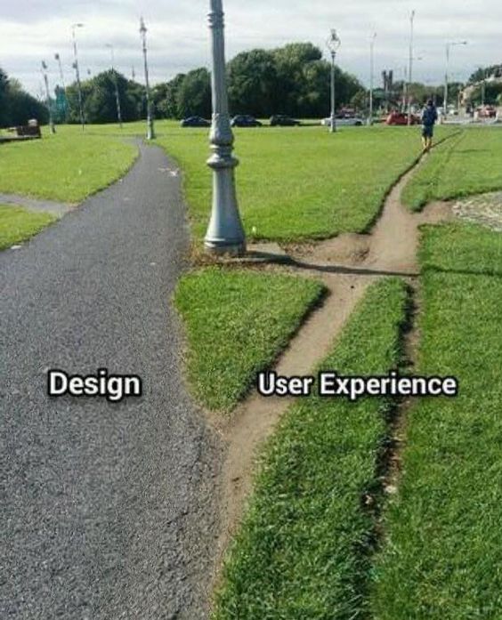
UX Design stands for "User Experience Design" and UI Design is the abbreviation for "User Interface Design." Both concepts denote how a "user" engages with, behaves and what they experience when interacting with what you are selling. Most commonly, the context for these terms applies to a website, but honestly, it really doesn't have to be limited to just a website. It's an important consideration whenever you're trying to communicate with someone who is using something you have to offer. What is the user's experience? How are they behaving when interacting with the interface?
If you're still not convinced this is all that important, then HORRAY! Because... now, I can share with you the most BANANAS example to illustrate the absolute significance of why UX design is kind of... everything.
This story in UX Land is called "The $300 Million Button" and the setting is this:
Circa probably around 2007-2008, a company who will remain anonymous but is categorized as a "major retailer" (we'll call them "X"), hired a consulting company called "User Interface Engineering (UIE)" run by a guy named Jared Spool. They wanted to increase their sales and noticed that a lot of people were putting items in their shopping cart but not actually making a purchase. Jared's team studied X's website and then observed people using the site. What they found was that when people went to make a purchase, they first put the item into the virtual shopping cart, and then went to check out. Once they hit the "Checkout" button, they were brought to a Checkout page where they were asked to either log in, if they already had an account or register. The original website designers had assumed that people returning to the site would remember their login credentials (if they didn't there was a "Forgot Password" link below) and that new users wouldn't mind easily entering a few simple pieces of information because, after all, they would probably be back and would appreciate not having to enter all of the information again. A reasonable assumption, but as always, you know what they say about assumptions.. "when you ASSUME, you make an ASS of U and ME".
So, as Jared's team was observing users on the site, they noticed that people were getting really tripped up by needing to remember their information or creating a whole new account which seemed cumbersome and often times, just abandoning their cart as the friction wasn't worth it. The feedback they received from new users was that "they weren't there to create a relationship with the retailer, they just wanted to buy something." Additionally, first time customers couldn't always remember if it was their first time purchasing something from the site, so they would become frustrated when the site couldn't find their email address or the email/password combinations weren't matching. UIE couldn't believe how resistant first time users were to registering.
Things weren't any rosier for repeat customers. They too, experienced the same frustration with their emails and passwords not working. Some had changed emails since the last time they made a purchase from the site. Others couldn't remember their passwords and after several, often incorrect, guess attempts, only a handful went through the process of having a new password sent to their email which they then had to reset. All in all, it was a negative experience.
So UIE came up with a solution. They replaced the "Register" button on the checkout page with a "Continue" button and put the following message beneath it: “You do not need to create an account to make purchases on our site. Simply click "Continue" to proceed to checkout. To make your future purchases even faster, you can create an account during checkout." They also allowed repeat customers to checkout without having to log in.
The result? Within the first month since the change, sales went up by $15 million and by the end of the year, $300 million, garnering a 45% increase in sales overall.

Pretty nutty, right? But also, pretty worth it! This concept doesn't necessarily have to be something that only applies to people building a website, however. The idea of considering user "experience" when developing and building a strategy for anything you're trying to sell can be invaluable. Considering what people respond to, what they used to seeing and don't need to relearn, what their pain points are, what isn't clear to them, and what's causing friction between them and your company, site, product, etc., can save you or earn you, depending on how you look at it, lots more money in the long run. Opportunity cost, baby!
So, I've decided to break this post up into two sections since it's so hearty, and will therefore be posting next week about ways to optimize whatever you're trying to sell to incorporate UX design and principles. Is the anticipation palpable or what?!?!
To Be Continued...