
Since I know you all have been waiting on the edges of your seats since last weeks post, you can cool your jets now because I've got tasty morsels of information for you today. Those of you who didn't tune in last week, let me bring you up to speed, riiill quick. Last week we discussed the concepts of UX Design and UI Design along with an illustrious story that highlighted the value of these ideas. I hooked last week's readers by telling them how big of a difference including UX/UI design principles into your website or product can make and then left them with a true cliffhanger as to "HOW." I'm SUCH a tease! Luckily for you, if you haven't read last week's post, you can binge-read that one and this one back-to-back, without any lag time in between... Procrastination pays off! So, peep last week's post - The 300 Million Dollar Button, before reading this post. We'll see you back here in approximately 4 min.
For the rest of you patient lot - let's get into it! The reality of UX guided design is there is not one right way to do it. This is not an either/or, good/bad type of thing. There are many ways to skin a cat and there are also many ways to design a site or product that is pleasing to the user and allows themto easily find and accomplish whatever they are trying to do/you want them to do on the site. That being said, there are some tried and true UX Design principles that influence almost all users favorably.
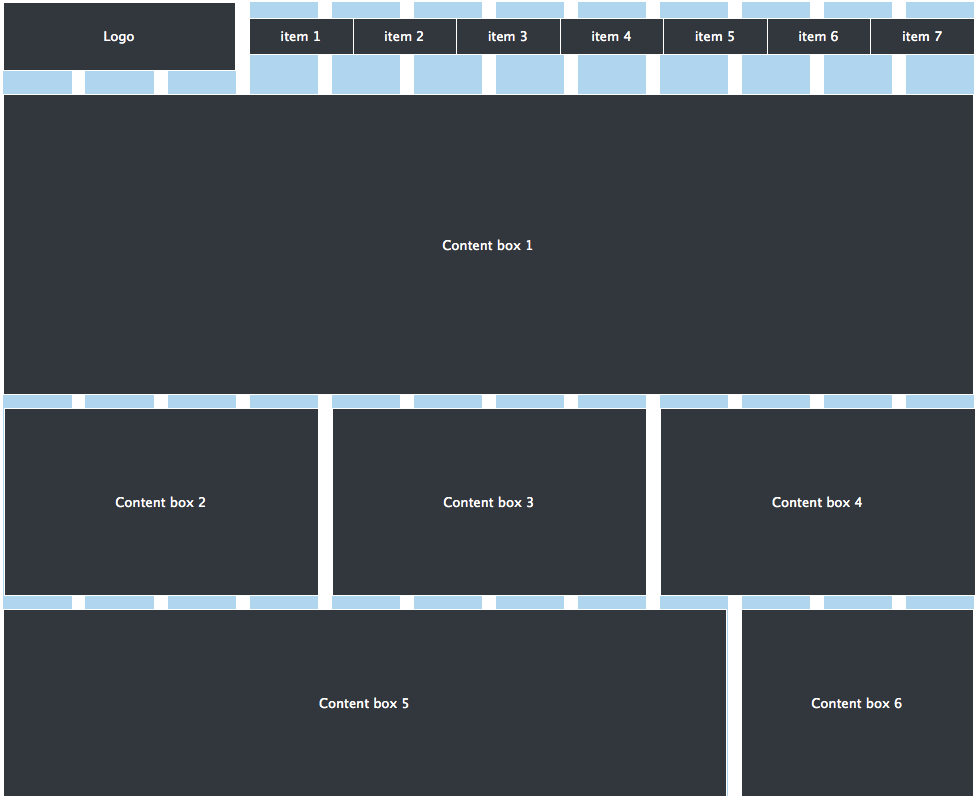
GET ON THE GRID
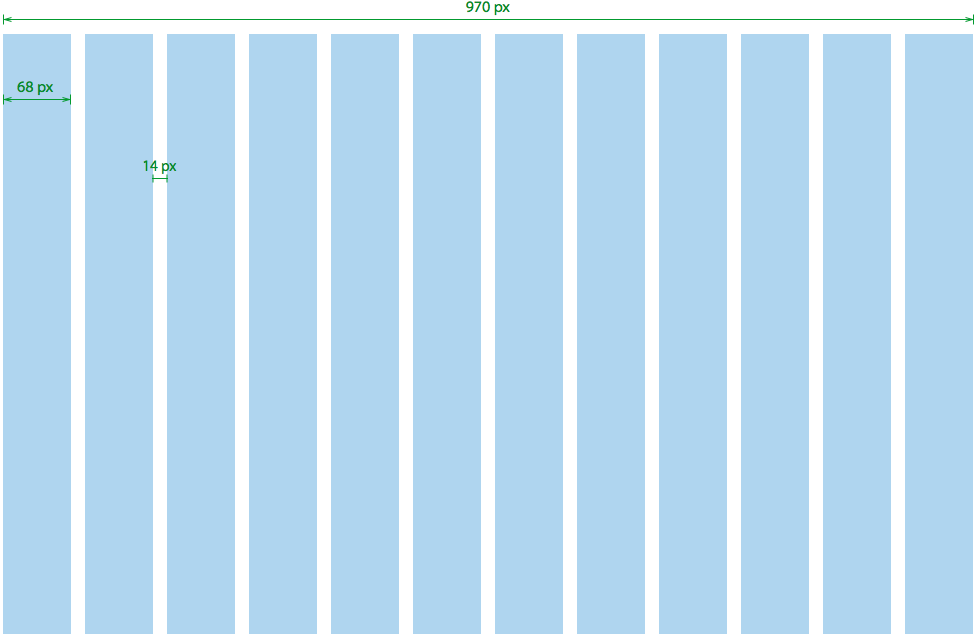
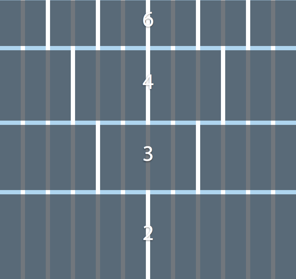
The proximity and placement of various components on a website can be fundamental for helping people determine what's going on on your site and make sense of it quickly. A grid system helps you to convey the components of your site in an organized way that allows users to see a pattern or order and then process pieces of it in chunks (the good kind of chunks :), rather than one at a time. A 12-grid system is generally the preferred grid as there are so many numbers that it is divisible by and thus it can be broken into a variety of combinations.
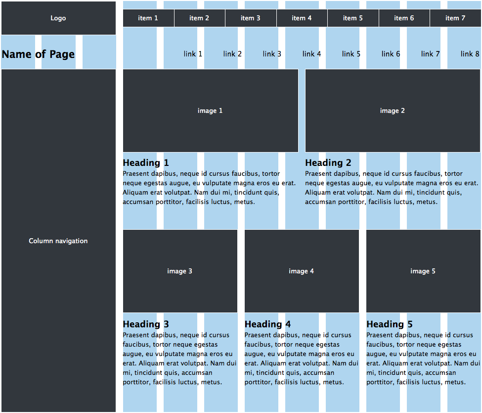
HEAD IT UP
If a website was like Mario Kart, headers are like coins. They're an added boost for SEO (search engine optimization) as Google give headers more credit but they also keep you on track and are like a bonus for site visitors. Users appreciate them because it tells them what the text below is about and then they can assess if it's important to them or not. Once again, they allow the user to process information on your site quicker.
CONSISTENCY IS KEY
When people come to your website for the first time, they don't know where anything is, how to find what they are looking for, what is important to them, or how to get to where they need to go. Similar to looking at a map, it takes a second or two to get acquainted and familiar with what's going on, how the information is laid out and then actually read it. Most maps have a key showing consistent elements that are repeated in the map to help the person viewing the map not have to make sense of every aspect each time from scratch. By using consistency of fonts, colors, icons, buttons, etc for elements that are repeated throughout the site, you are essentially developing a key for the user. If they see a button that is in a black, in a square shape with white text in a Times New Roman style font, then when they're looking for a button that does something else, their eye will have a better idea of what to look for. Having different fonts on a website is good because it adds dimension and feeling to the design but each font choice should have a role and should be used when its role is appropriate. For example, certain headers should be a certain font, size, color etc which should be different than regular text. If you're explaining an instruction or non-pertinent information, you could use an italicized font in a lighter color to show the user that the information is helpful but not necessary to read. Consistency falls under the idea of "grouping" which shows the user that things are related and have similar meaning if they have the same attributes. Grouping allows us to digest larger amounts of information quicker and easier. Additionally, you can use subtle lines to connect various pieces of related information together or to create sections, grouping related together as well.
DON'T REINVENT THE WHEEL
There are already ways in place that user are used to for certain basic functionality. They are used to seeing the navigation either on the top or the left hand side of the website. Most people are used to clicking the logo and being brought back to the home page. They know that if certain words in a body of text are a different color, it may be a hyper link. They are used to logging in in the top right corner of the website, etc. You don't need to try to get cute by doing something different only to end up confusing the user. From a business perspective, the less time you need to spend educating your customer, the better. Don't waste the attention the user is giving you on them trying to figure out how to sign up or log in. Save the WOW factor places where differentiating yourself will make a positive impact.
READ BETWEEN THE ALIGNS
There are times when stylistically, having different alignments or placement on a website can make a site look better but a general rule of thumb is remembering that people read left to right and top to bottom. Therefore, placing more important things on the right hand side or at the top is a good guideline to follow. Additionally, drawing out your designs on paper is extremely helpful as studies have shown that we think better by putting a pencil to paper and you may be inclined to draw what feels natural to you (left-right, top-bottom).
a pICTURE = 1,000 WORDS
Too much text can be a turn off to any site visitor and looks like work. Additionally, if you have important messages about using the site or about your business or brand, that are buried in a lot of text, it may not get read and... that could be bad. If there are opportunities to convey concepts or ideas using imagery instead of words, then use it! Explanatory imagery could also include using icons instead of buttons with words on them, illustrations or photos as headers, or video or images to infuse brand messaging into your site. This is a great area to get a little creative.
dON'T TIP THE SCALE
Good design should have balance and symmetry. Naturally, we are attracted to things (and supposedly people) that are symmetrical and balanced, so making sure your site doesn't feel lopsided will help you communicate in more stable, consistent, and harmonic ways. Good design is always part of UX design, as aesthetically pleasing elements can make people trust you, feel calm, feel inspired, happy etc and result in a positive "experience." However, one thing to be cognizant of is a balance between simple design that looks good and explaining important components to the user. Clear explanation might mean more words, a larger font, premium placement, etc. Ideally, your site does both but that can be atough balance to strike. At the end of the day, clear layout, language and placement trumps aesthetics because, if you've brought the horse to water and he's thirsty but can't figure out how to drink, then ultimately -> FAIL.
Ultimately, UX Design can be summed up in one word - EMPATHY. Empathy is defined as the experience of understanding from another person's perspective - which sums it up better than I probably have in two articles. Empathy by nature is difficult and it's impossible to truly understand how someone else feels or perceives something but you can get closer to the mark by collaborating with others when coming up with your design. Tunnel vision is natural but by discussing or working on the design with other people who bring different skills, experiences and ideas to the table, you can create even slightly more empathetic design.